
Time-traveling epidemiology
Published:
Suppose you’re an epidemiologist who recently came into possession of a time-machine. Following an outbreak of a mysterious disease in a small community of individuals, your job is to go back in time to do everything you can in order to curb the spread of the disease. The only information of the system you have is the (i) contact network of the community and (ii) the index case of the mysterious new disease. Your only allowed intervention is the quarantine of a single individual in the population. Of course, you could try to convince the people in the community that you are a time traveling epidemiologist, but they would very quickly dismiss you as a crackpot. Furthermore, you are not allowed to remove the index case, as clever as that may seem.
The interface used to mimic such a scenario is given below. Ultimately, you will decide the nature of the contact network between the individuals and then make your best guess as to which individual should be removed so as to best mitigate the severity of the subsequent epidemic. This type of network can be set in the “Select graph type” dropdown at the top of the menu. The network can be random ($G(n,p)$, or the Erdős–Rényi random graph), small-world, or a network generated with the Barabasi-Albert algorithm. Characteristics of the disease can be controlled using the other slidebars, including infection probability per contact and the recovery rate. Additional options to adjust the graph will appear depending on the particular type of graph you chose at the beginning. Note that the graph is interactive so that you’re able to zoom in and scroll around to make node labels easier to read or to inspect the graph structure more closely.
Selecting individuals in the network will highlight them and their immediate neighbors. After you pick an individual to remove, simply click “Remove node” to remove them from the network. After you remove a node, click on “See results” to see how you did in preventing the spread of the disease! To determine this, some stochastic simulations on the network are ran in the background to see just how effective your choice was in reducing the total number of infected individuals. Simultaneously, various centrality measures will be calculated on the network. For each measure, the highest-scoring node is removed and the same batch of simulations ran on the new network to see how your choice compares to those by the computer. Be patient, as this step requires a bit of computation.
A few finer details about the app: The simulation runs a few hundred stochastic simulations for each measure, as well as the choice of the user, so computation time may be a few seconds before the results show up, especially if the network is large. Note that the simulations are stochastic, so the percent changes may seem a little odd at first, especially if the network is small! For example, even if the computer and the user choose the same nodes to remove, the difference in results could be anywhere around $\pm5\%$. This problem can be mitigated by increasing the number of nodes, but at the cost of computation time (really only a few seconds). The percent change reported is the difference in the total number of infected nodes before and after that individual was removed from the network. A negative difference means that less people were infected after the change was made, while a positive difference indicates that more people ended up infected after a change was made.
The betweenness centrality used in the simulation is shortest path betweenness centrality. I wanted to include random walk betweenness centrality [2], which is probably much more useful as a centrality measure in this case, but there wasn’t a local function for this in igraph and I was in a hurry to get this app up and running! Perhaps an update later on will include this…
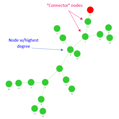
One of the reasons for including the centrality measures bit was not only to add a bit of competition to the challenge (who likes losing to the computer?), but also to compare the effectiveness of each metric in determining the “most important node.” I put this expression in quotes as “most important” can mean a lot of things depending on the context of what you’re studying. Even if the context is rigid, as it is in this case, it can still vary quite a bit depending on the characteristics of the graph used to model the contact structure. As an example, many people when presented with this hypothetical scenario will immediately resolve that the node with the highest degree (i.e. the person with the greatest number of neighbors) should be removed. This isn’t totally unfounded, as this choice seems to work well when the contact structure is random. However, this approach can breakdown if we become a little more creative with our graph generation. If we construct a B-A graph, which has a branch-like structure, the nodes with highest degrees may not be the best choice. In fact, they usually aren’t! Consider as an example the graph shown in Figure 1. If we were to choose the node with the highest degree to remove, this would definitely reduce the total number subsequently infected. Is there a better choice? Observe that there are two nodes that connect the index case to the main “stem” of the network. Obviously removing these would be better, as this would prevent the infection from spreading beyond the branch of the index case!
This is just one example of how centrality measures can be stellar in one context and then completely miss the mark in a different one. Especially for large networks or networks of real systems, it can be quite hard deciding which centrality measure to use!
[1] Newman, M. Networks, Oxford University Press, 2018.
[2] Newman, M. A measure of betweenness centrality based on random walks, Social Networks, 27 (1) 2005, pp. 39-54.